Ranking the 10 best Mets uniforms ever, including where new City Connect threads land
April 27th, 2024Since the Mets‘ inception in 1962, they have gone through lots of changes when it comes to their uniforms.
Some of those changes have been small, and others — like the introduction of black as a team color — have been big.
There have been hits (including the blue alternate jerseys) and misses (including hideous black drop shadow, which we’ll discuss in great detail below).
The jersey/pants combo has been through the most changes, though there have been a bunch of different hats introduced as well — especially over the last 25 years.
Let’s rank the 10 best Mets uniforms ever…
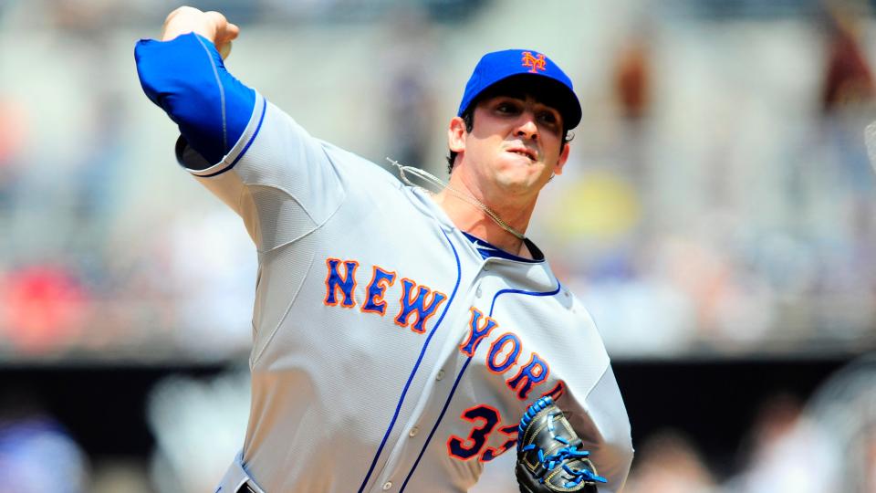
No. 10: 1987 road uniform with script on jerseys
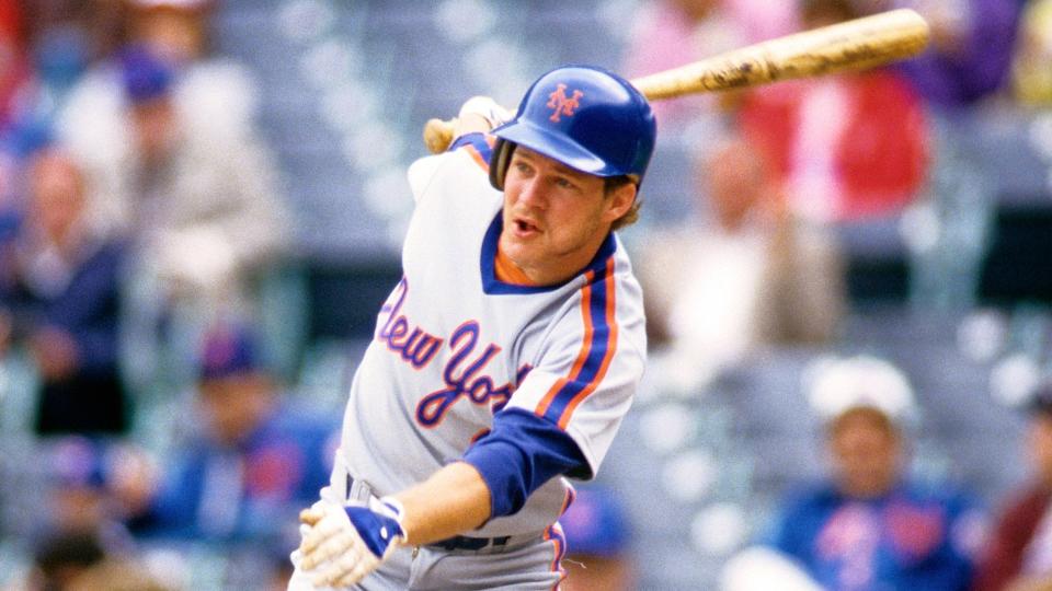
The Mets wore these jerseys in 1987 only, and the “New York” in script was a nice change from the “Mets” the team had on their road jerseys in years prior.
These jerseys were scrapped after just one season, with the Mets going to a block “New York” from 1988 to 1992 that too closely resembled the Yankees’ road jersey font.
The team also had road script jerseys that debuted in 1993, but it was a different font than the ones worn in 1987 and the “New York” was underlined — those jerseys were paired with home jerseys where “Mets” was underlined
No. 9: Snow White home uniform
These uniforms, which were an alternate that removed the blue pinstripes from the home jerseys and pants, debuted in 1997 along with the now-infamous white hat that had a blue bill and blue “NY” outlined in orange.
Those hats were known as the Mets’ “Ice Cream Man” look and were quickly abandoned.
The Snow White uniforms stuck around for a while, though, and were a nice alternate.
No. 8: Classic Black Home jersey/hat
The Mets’ black home uniform, which returned during the 2021 season, was originally introduced in 1998 when the team unveiled it during an event where some of the players modeled the new duds.
Along with the black jerseys came a black hat with blue “NY” that was outlined in orange and white. And the Mets soon introduced a black cap with blue bill that had a blue “NY” outlined in orange.
The introduction of black as a Mets color also soon led the team to add black drop shadow to the home pinstripe jersey, home snow white jersey, and road gray jersey (on the “Mets” at home and “New York” on the road, and on the front and back numbers and name on the back), which — to this writer — was a step too far and came pretty close to ruining the above uniforms.
To be clear, the black jerseys are sharp — as are the black hats (which also returned in 2021). But that the color black took over the rest of the uniforms in the rotation back in the 90s and into the 2000s — and that the Mets pretty much stopped wearing the blue caps on the road at one point — was a very, very bad development.
Ahead of the 2024 season, the Mets made a big change to the black unis, removing the white shadow from the logo on the hat and from the the “Mets” and numbers on the jersey.
With black back in the rotation, here’s hoping the rest of the uniforms are left black-drop-shadow-free. Oh, and if they want to bring back the black road jerseys (more on those below), that would be cool.
No. 7: Classic Black Road jersey/hat
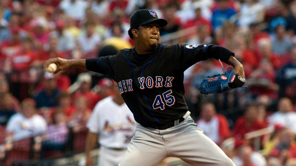
The black road jersey with “New York” on the front in the Mets’ classic font was introduced in 1999 and was often paired with the black hat with the blue bill.
Some of the Mets’ best moments in 1999 and 2000 happened with the black jerseys on, and they clinched the NL East title in 2006 while wearing the black jerseys and hats at home.
No. 6: City Connect uniform
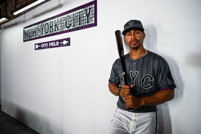
In the brief history of MLB City Connect uniforms, there are far more misses than hits. But the Mets’ City Connect threads, unveiled during the 2024 season, are a hit — due to how seriously the team took their creation and how attentive they were with the details.
The point of the City Connect uniforms is for them to represent the city the team plays in, and the Mets nailed that by featuring a subway token as the sleeve patch, the Queensboro Bridge on the hat (and sleeves), pinstripes that are in the shape of the diamonds and circles of the city’s subway lines, and the purple flourishes throughout that are a nod to the 7 train that brings fans from Manhattan to Queens (and back).
Then there’s the “NYC” on the front of the jersey, which is in the same font the Mets have been using since 1962 on the “New York” emblazoned across their road jersey.
The pants, which are often monochromatic (and tacky) when styled with the City Connect uniforms, are white and have purple and black piping — a nice touch.
Another big win here is that the Mets found a workaround to the new league-wide-mandated smaller names that are on the backs of all the new jerseys. By using the same font they featured on the front of the jersey for the names and numbers on the back, the Mets’ names and numbers look more like the classic jerseys MLB featured before 2024.
There has been some nitpicking of the uniforms because they say “NYC” instead of “QUEENS” on the front. But while the Mets play in Queens, they represent the entire city and surrounding area — making “NYC” the right choice.
No. 5: 1978-82 Home and Road uniform
For the first time, the Mets wore pullover jerseys.
These jerseys (white at home and gray on the road) featured orange and blue striped trim on the collars and sleeve edges. There was also heavier striping down the edge of the road pants (hat tip to the 1993 Mets yearbook for that nugget).
The Mets teams of the late ’70s and early ’80s didn’t have much success, but at least they were nicely dressed.
No. 4: Blue Alternate jerseys
The Mets introduced home (orange “Mets” across the chest) and road (silver “New York” across the chest) jerseys before the 2013 season — the year the All-Star Game was played at Citi Field.
As is the case with the black jerseys, it can be argued that the road versions of the blue alternates (which the team no longer wears) are even sharper than the home versions. But both of them are terrific.
The Mets also added a new alternate hat in 2013 — blue with an orange “NY” with a white outline and an orange bill. And in 2015, they introduced an alternate road hat that was all blue with a gray “NY” outlined in orange.
The blue alternates made an appearance during the 2015 NLCS that featured Daniel Murphy‘s home run barrage and were used again during the 2015 World Series.
No. 3: Home Racing Stripe uniform
These uniforms debuted in 1983 and the Mets wore them (in this pullover iteration) through the 1990 season along with the matching pants that completed the racing stripe look.
When the jerseys were introduced, the Mets went without the skyline logo on the sleeve. They did wear a 25th anniversary patch on the sleeve during the 1986 season, though.
There are some Mets fans out there who hate the racing stipe uniforms, and there certainly is a bit of added nostalgia factored in since the team won the World Series while wearing them in 1986 (and went to the 1988 NLCS while wearing them).
But regardless of the success the team had in these jerseys, they were totally different and very cool.
They also aged well and looked crisp and clean when worn in 2006 and 2016 as the Mets celebrated anniversaries of the 1986 World Series team.
No. 2: Road Gray uniform
Not much has changed from when these were the original road Mets uniforms (with the blue hats with the orange “NY”) in 1962, though the Mets’ first jerseys in 1962 and 1963 (on the road and at home) didn’t have numbers on the front. Those were added in 1964.
The skyline Mets logo was on the sleeve of these jerseys when they debuted in 1962 and is still on the regular road and home jerseys today.
Before the 2012 season, the hideous black drop shadow from the front and back of the jerseys was removed and restored the road grays (with the blue hat) to their former glory.
No. 1: Home Pinstripe uniform
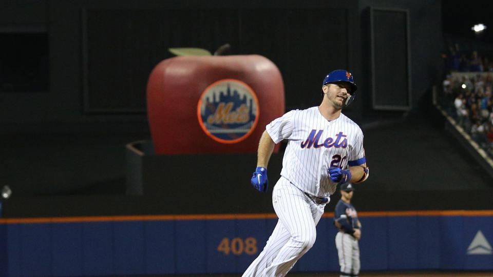
The Mets’ original colors were “Dodger blue” and “Giants orange” for the two departed New York National League teams. And with those colors front and center along with blue pinstripes and the blue cap with the interlocking orange “NY,” the Mets’ classic home uniform is as close to perfect as it gets.
Along with the classic road grays, these jerseys were desecrated when the black drop shadow was added on the front and back from the late-90s through 2011, but it was removed before the Mets’ 50th anniversary season in 2012.
From the 2012 season through the 2014 season, the home uniforms were actually cream colored with blue pinstripes, but they returned to being white with blue pinstripes before the 2015 season — just in time for the Mets’ most recent run to the World Series.
Disclaimer/Note: TGM Radio’s latest news posts are a collection of curated and aggregated, fresh content from the best news sources across the globe.
Tags: sports